

Taking Risks Inside the Design Process
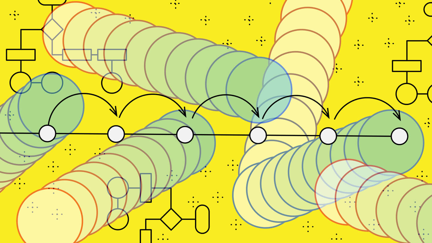
In the days before graphic design went digital, there was a linear process that most designers followed, which had a clear beginning and end—that end being a static, printed object. In the digital environment, there is always space to tweak, rework, redesign, re-theme, and so on. Design lives on, whether the original designer is paying attention or not. Which is why I started to ask myself, how can we create in a more collaborative environment with the expectation that the design will live past the designer? What might a non-linear process look like, and how does that play out in a team scenario? What does it mean to be risky in a design environment? Taking a risk in this space is important because the rules are always changing. We need to take risks in order to learn, grow and improve.
My initial thought was: What if we changed the design process to mimic the pairing between designer and developer? What if designers were more inclusive in their process and shared more skill sets in order to strengthen the final output by working through the design decisions together? Some may find this approach to be difficult because one of the main joys and perks of designing is finding time to zone out and create. However, finding a way to share tasks—like bringing an interaction and visual background to the table collaboratively—might just be the way to break out of the traditional methods of working.
Last year, I wanted to deconstruct my approach to how projects and process should play out, and find room for improvement, advancements and innovation. I experimented with organizing around two options: The first was linear, and the second was cyclical. Along with my project teams at frog, we were able to use two active projects to experiment as we honed in on finding improvements in our process.
The linear approach: Testing a collaborative method to create efficiencies and ensure timely delivery
In the first project, we were asked to transform a digital experience, which included rebranding the digital platform, creating updated content and delivering a working prototype—all on a shortened timeline. The designers took it upon themselves to test this method of design collaboration, which resulted in an interesting and hyper-efficient working environment. The visual designer completed a four-week long exercise in defining the brand, after which the client signed off on the direction. We then had four additional weeks to figure out how to design and build the prototype. Because of the time constraint, the designers ended up having to draw the interaction journeys and visuals at the same time. To do this, the team created a shared library. The interaction designers picked up the components and modules being created by the visual designers and essentially designed the journeys using final visual treatments. The visuals were fairly well-defined before the program began, but this allowed for any changes that came to be incorporated and shared out to the larger designer team more smoothly.
We ended up using this approach on several other projects of this nature, and while the ramp up might be difficult, it got us to a place where the full user experience benefitted from the connection between the different disciplines. In other words, we were more efficient, the visuals were more innovative and the interactions were more compelling. Because of the efficiency, the team had the time and 4x the brainpower to work out more exciting and meaningful details, while also being more challenged in the visual realm.
We tried this approach on a subsequent project with a different client; only this time, we didn’t have the same runway at the start to clearly define the branding for the digital experience. The challenge was: If we have to start sprinting from nothing, where do we begin?
Many designers and theorists have offered up different solutions to this problem. The most common suggestion yet has been to use Google’s Material Design. Then other systems like UX Power Tools were brought into play. The main issues we faced with these systems is that, while they are really really good solutions, they’re not bespoke and they take too long to ingest. UX Power Tools took four weeks for a designer who was new to Sketch to truly be able to intake. Seasoned product designers might have a quicker run of it, but we aren’t an in-house team—our teams need to flex and learn fast, often jumping around between programs and variables in standards.
The results here were not as ideal, mostly because we didn’t have enough time to iterate on the visuals upfront before we dove into the rest of the interactions.
The cyclical approach: Start with a standard set that can be adapted throughout
Our test for the second project was a to create a unique series of files that could be updated and easily re-branded in order to provide clients with the fastest way to get to a final product in design. The generic designs allow for any possible contingency and can guide the team into making the most important assets while having an undefined backup for anything still developed.
The concept was well-received by the team. Everyone wanted to adopt this approach immediately into their projects, and it led to an additional project with developers that allowed us to create an offering unlike ever before. This non-linear approach allows designers to pulse in and out of different aspects of the design without disturbing any other workflows or updates.
The issue we faced, however, is that the files are so complex it’s really difficult to understand the system if one is new to the project or interrupts that system with a new set of styles. As this step doesn’t come naturally to designers, we are still finding a way to work out the kinks.
All designers start a project by opening up sketch and creating concepts. We need to change this automated behavior by starting at the end of a different project when approaching the production of a digital experience. Brand treatment aside, many of the components we see out in the digital universe are pretty standard. A toggle is a toggle, it needs to be recognized in order to quickly indicate behavior. It’s just not necessary or recommended to change the basic behaviors, unless the direction of the project is to actually change behavior. If we know that there are a handful of parts and pieces that we can start with, synching an update once the brand is defined, is potentially a much simpler way to work. It also strongly promotes a complete collaboration between designers, as in the first experiment.
We have yet to master anything, but we keep pushing to bring interest, to make change and to take some uncalculated risks in order to push to the edge. In the end, this approach takes as long to master as any other full system like Material or UX Power Tools.
Refining the process for further implementation
Refining the process in the first test will allow us to make things quickly if we have a starting place in the brand identity. The second test taught us that while the technical aspects of the work might be more complicated, a system can be created without the need for a full suite of bespoke UI elements, but that more work needs to be done to make this approach more teachable and manageable.
With this in mind, I hope to keep pushing the edges of process in order to find ways to release the best designs from our minds and into our products. The computer and human go hand in hand, and it might only be the risks that we take to shake up our relationships that can create innovative work and unexpected outcomes.
Change is hard, but change is always good

As Creative Lead of frog’s New York studio, Halle leads a team of talented interaction and visual designers to deliver on a complete user experience across projects. Halle is responsible for growing and maintaining the culture of design in the studio and ensuring quality and inspiration on projects. Prior to frog, Halle was Senior Creative Director for Barnes & Noble, where she was responsible for the rebrand of BN.com. She started her career in agencies, where she led client teams for brands like Tommy Hilfiger, Grey Goose Johnson & Johnson and Armani. Her award-winning work has been shown at the Cooper Hewitt and MoMA.
We respect your privacy
We use Cookies to improve your experience on our website. They help us to improve site performance, present you relevant advertising and enable you to share content in social media. You may accept all Cookies, or choose to manage them individually. You can change your settings at any time by clicking Cookie Settings available in the footer of every page. For more information related to the Cookies, please visit our Cookie Policy.
Our Studios
